llwx
Rationale
We combine two different of Sans serif fonts. For G.R.E.E.N.S we use a outline font that stand out from the overall and bring out a retro style. As for the work + shop use a thin style to make the contrast and balance between the two words. As for the two circles give a friendly feel for overall.

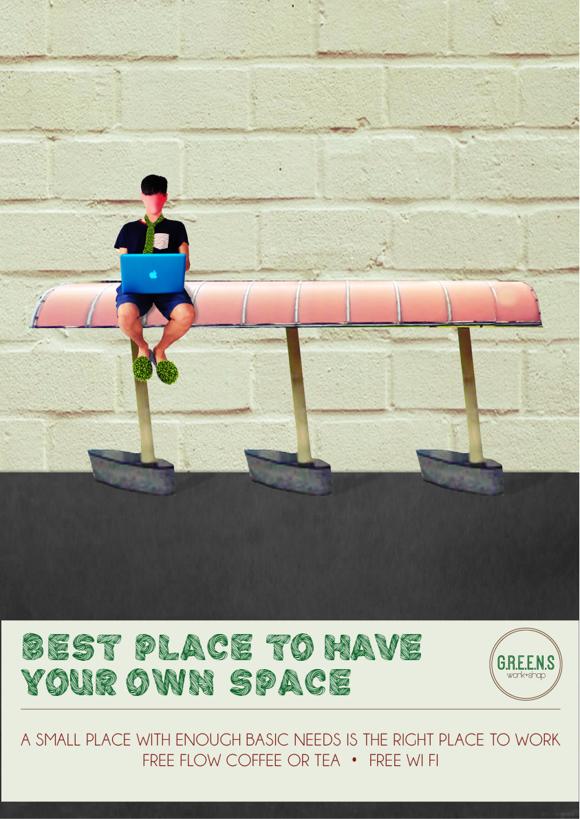
BODY COPY A SMALL PLACE WITH ENOUGH BASIC NEEDS IS THE RIGHT PLACE TO WORK FREE FLOW COFFEE OR TEA, FREE WI FI
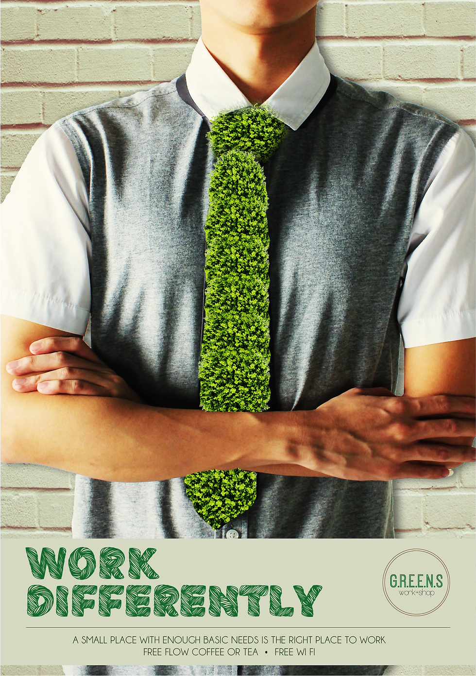
BODY COPY A SMALL PLACE WITH ENOUGH BASIC NEEDS IS THE RIGHT PLACE TO WORK FREE FLOW COFFEE OR TEA, FREE WI FI
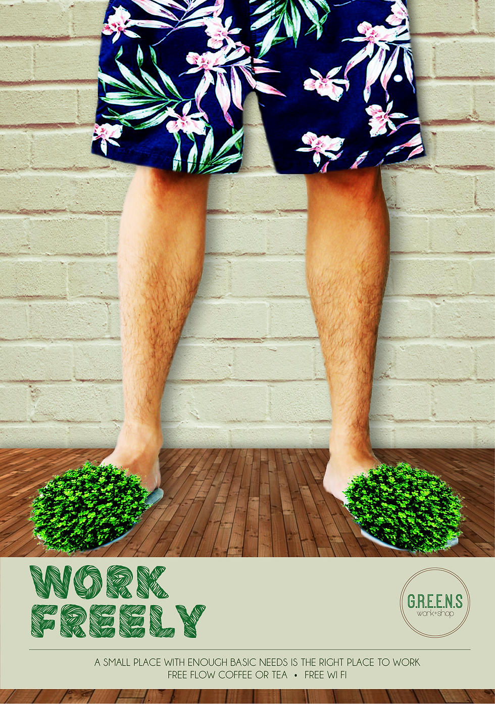
BODY COPY A SMALL PLACE WITH ENOUGH BASIC NEEDS IS THE RIGHT PLACE TO WORK FREE FLOW COFFEE OR TEA, FREE WI FI
Prints Ad

Sub-Headline OPENING SOON! BODY COPY A SMALL PLACE WITH ENOUGH BASIC NEEDS IS THE RIGHT PLACE TO WORK FREE FLOW COFFEE OR TEA, FREE WI FI
Event Poster
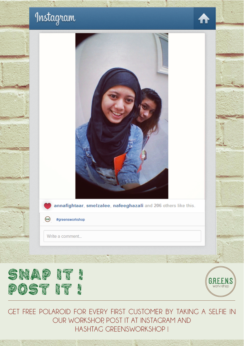
BODY COPY GET FREE POLAROID FOR EVERY FIRST CUSTOMER BY TAKING A SELFIE IN OUR WORKSHOP, POST IT AT INSTAGRAM AND HASHTAG GREENSWORKSHOP!
Digital Application
BODY COPY A SMALL PLACE WITH ENOUGH BASIC NEEDS IS THE RIGHT PLACE TO WORK FREE FLOW COFFEE OR TEA, FREE WI FI